Documentation
Nothing you see on this web site is old. Almost everything has been created
in the past decade, some of it in the past year or two. To be sure, we used old
maps, sources and images in our work, but we transformed each one into
something qualitatively new. Now any digital version of a text, painting or
map is fundamentally different from its analogue counterpart, but when it comes
to an historical document this difference takes on a much greater significance,
for its very being has changed.
This raises a big problem. Both the form and content of an historical
document are essential to understanding what it has to tell us about the past.
By digitizing a document we change both, so necessarily it will be telling us
different things about the past. Some of those things will not be true. Others
will be misleading. While yet others will be telling us things that the people
who created the document would not have known about themselves or their world.
To make sense of all of this, you need to know what it is we did.
Documentation records what we did. Being aware of what we did and why, will
help you to assess how the meaning of the many traces from the past found in
this site may have changed. This will make you more critical of our material.
It will also make the material more meaningful.
MAP is a way for people to share their data. Our guiding hope has been to
create a modular system that will grow by continual add-ons - new layers, new
variables, and new links among them - like what you might build with Leggo. The
system is conceived to serve many users, many purposes, to tap various
disciplines, and to portray events geographically, socially, and temporally.
Differing visions within MAP generated creative
tensions and fuel on-going discussions about where we should go from here.
MAP brought together people who had been active in three major research
centres on 19th century Montréal. Their desire to build collectively on the
work of the many individuals and groups active in the field reflected their
diverse experiences with the past and differing visions of the future.
Understandably, the most influential vision has been that of our founding
co-ordinator Sherry Olson. Inspired and taught by her graduate students, Sherry
made the geography department at McGill a centre for socially-informed
historical geography.
Sherry had developed an approach and a technique which proved essential to MAP.
The approach privileged median rents as the most sensitive social indicator for historical
urban geography. These medians were calculated from municipal tax rolls. The technique
identified streetscapes, generally both sides of a street for several blocks, as the most accurate mode of
spatially representing this data. A 1983 article in
Cahiers de géographie, that she co-authored with David Hanna,
explained the theory and method that they designed for their plates on Montréal
in the Historical Atlas of Canada, (Vol II and Vol III.)
The second major influence was that of Jean-Claude Robert, a leading social
historian of 19th century Montréal and the author of the standard reference
work on historical maps of Montréal. In the 1970s, working with the Groupe
de recherche sur la société montréalaise au dix-neuvième siècle at the
Université du Québec à Montréal, Jean-Claude co-authored highly influential
articles on occupational structure
and the importance of urban land.
Under his co-direction, the GRSM conducted pioneering research on census
returns to challenge the prevailing traditionalist interpretation of
19th-century Québec society.
This long experience with routinely generated nominal series, such as tax
rolls and census returns, meant that when MAP started, we could build on a
considerable body of completed research on industrializing Montréal. It also
explains one of the central methodological choices influencing the architecture
of our system. Although we did extensive work with period maps, the key source of
reference for the 1846 and 1880 layers were the 1848 and 1880 tax rolls,
because they alone provide both land registry numbers and street addresses.
This meant that whenever there was a disagreement between two sources, the tax
roll was considered to be the governing source. The result is an historically
coherent geographic information system.
Privileging nominal series was at odds with a third influence on MAP's
development. Initially working with the Montreal Business History Group, and
subsequently at Memorial, Robert Sweeny had developed a quite different theory and method for understanding the past. He proposed a 'cubist'
portrait of pre-industrial Montréal, wherein each source is treated as distinct
because endowed with its own historical logic. From his perspective, one should
not privilege one source over another. Contradictions between sources are not
problems to be resolved, but rather evidence of the complexity of the past. In
a article on initial lessons learned from
MAP, he explored how disciplinary conventions hamper our seeing the differing
nature of our sources.
Differing visions within MAP generated creative tensions and fuel on-going
discussions about where we should go from here. We have, however, resolved
the question of according priority to a particular source. In 1825, no
standardized street numbering system for Montréal existed, and so there was no
easy way to link nominal series to the map. Not being able to do the linkage,
Sweeny might be said to have made a virtue out of necessity. When, with the
collaboration of Jean-Claude Robert, he used the Sulpician's terrier
to create a GIS for the town centre for 1825 to 1840, he too privileged his
textual source over the map. He argues this confirms his earlier assessment that geographic information systems, as one of
the quintessential technologies of contemporary capitalism, tend to hide
important features of the city as people experienced it.
Our entire system is erected upon a digital map that we constructed from
files lent to us by the Service de géomatique de la Ville de Montréal,
They provided us with a set of MapInfo files of the city for the year 2000,
known as the SIURS geobase, and an extensive set of CAD files. Working in
consultation with Michel Reney (Service de géomatique), Rosa
Orlandini converted these into ArcView files. As the original geobase did not
include adequate metadata, or documentation, we prepared a handbook, as well as
metadata files, FGDC standard, for each layer. The city geobase included
present-day streets, blocks, lot lines and building footprints with addresses,
providing a framework anchored in modern surveying, metric measurement, air
photos, and an architecture of geodesy or geometry of the earth.
 To use maps from earlier dates, we stretch them like
a quilt in a frame, pegging them to the "official" or standard framework. This
makes it possible to compare maps made under quite different conditions and
for various purposes. The base map we created linked together hundreds of
different CAD files into a single multilayered system, which we used as the
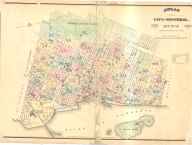
basis for a new map for 1880. There was no single Goad map; it was originally
published as an atlas of 44 two-page plates. The closest thing to a view of the
whole city in Goad was the index plate reproduced here. To see how really new
our map is, compare this image to the detail in the banner at the top of this
page. The Goad plates were published at a scale of one inch to 200 feet (or
1:2400). Our task was to recreate this series of images as a connected system
consistent with the projection used by the city (nad83 zone 8). Orlandini and
Kevin Henry tested alternative procedures: ArcInfo8 steps; ArcView with script
ImageWarp; and ArcView 3.2 with extensions Image Analyst and IMAGINE Image
Extension. We took the third option. Each plate was scanned by the McGill
Library one page at a time and saved as tiff files. Smaller, partial plates
meant that Sherry Olson with a team of graduate students had 89 images to
rectify.
To use maps from earlier dates, we stretch them like
a quilt in a frame, pegging them to the "official" or standard framework. This
makes it possible to compare maps made under quite different conditions and
for various purposes. The base map we created linked together hundreds of
different CAD files into a single multilayered system, which we used as the
basis for a new map for 1880. There was no single Goad map; it was originally
published as an atlas of 44 two-page plates. The closest thing to a view of the
whole city in Goad was the index plate reproduced here. To see how really new
our map is, compare this image to the detail in the banner at the top of this
page. The Goad plates were published at a scale of one inch to 200 feet (or
1:2400). Our task was to recreate this series of images as a connected system
consistent with the projection used by the city (nad83 zone 8). Orlandini and
Kevin Henry tested alternative procedures: ArcInfo8 steps; ArcView with script
ImageWarp; and ArcView 3.2 with extensions Image Analyst and IMAGINE Image
Extension. We took the third option. Each plate was scanned by the McGill
Library one page at a time and saved as tiff files. Smaller, partial plates
meant that Sherry Olson with a team of graduate students had 89 images to
rectify.
Rectifying a map means changing it so that the map shares the same
co-ordinates as another map. This involves identifying a point on each map that
you believe to be the same location and treating it as a control point or
anchor. After you have identified a number of anchors, the software warps the
overlay map to fit the co-ordinates of your base map. Initially we thought we
could use evidence from the built environment as our anchors. So, for example,
we would anchor the corners of Notre Dame church.
This assumption explains our decision to build our 19th century layers by
starting with the Goad. Once we had the Goad rectified, we thought we could use
it as the basis for the rectification of the Cane 1846 map and then use the
Cane as the base map to rectify the Adams 1825 map. Working backwards, we would
maximise the number of buildings appearing on both maps and so ensure the most
reliable rectification by increasing the number of potential control points.
To our considerable surprise, rectifying to property
lines proved to be considerably more accurate than using buildings as our
anchors.
Our initial rectifications highlighted the challenge of variability from one
plate to another and showed that we would need many anchors. The margin of
error was running from five to ten meters on most plates; where the comparable
error in a modern document created to current engineering standards from arial
photographs of contemporary buildings is in the order of one meter. Our high
level of inaccuracy was disturbing, as minimally we wanted the centre of any
lot to actually be within that lot, because this was where data points linked
to the lot would be placed. We thought an acceptable margin of error would be
approximately 3 meters, or less than half the width of almost all lots in the
city.
In many parts of the city there were no buildings from 1880 that had
survived to the present and so, faute de mieux, we used existing
property lines as our anchor points. To our considerable surprise, rectifying
to property lines proved to be considerably more accurate than using buildings
as our anchors. Although property lines are invisible abstractions, corner
lots, as well as intersecting property lines in the interior of a city block,
proved to be relatively stable features over 120 years.
 There were two types of lots visible on the 1880 Goad: building lots and
cadastral lots. In Goad, cadastral lots appeared even where no building had yet
been erected, and they usually appeared in the SIURS geobase even where
buildings have been demolished. Unfortunately, the extensive detailed
information written on the Goad plates meant that it was not possible to use
them as the basis for an automated drawing of the cadastral lines. We decided
to create a GIS layer of the cadastral lots using as our base the cadastral
maps of the city, parish and island of Montréal drawn by Louis-Wilfrid Sicotte
between 1876 and 1878. A detail of Ste-Anne ward is shown here. We then
rectified the Goad to Sicotte. Using the cadastral lots made it easier to
compare maps from different dates, and to move between them with greater
confidence, despite changes in house numbering and street names. There is a
slideshow available from the side menu illustrating how we created this
cadastral layer, as well as a technical paper explaining how we automated the
drawing of the lines.
There were two types of lots visible on the 1880 Goad: building lots and
cadastral lots. In Goad, cadastral lots appeared even where no building had yet
been erected, and they usually appeared in the SIURS geobase even where
buildings have been demolished. Unfortunately, the extensive detailed
information written on the Goad plates meant that it was not possible to use
them as the basis for an automated drawing of the cadastral lines. We decided
to create a GIS layer of the cadastral lots using as our base the cadastral
maps of the city, parish and island of Montréal drawn by Louis-Wilfrid Sicotte
between 1876 and 1878. A detail of Ste-Anne ward is shown here. We then
rectified the Goad to Sicotte. Using the cadastral lots made it easier to
compare maps from different dates, and to move between them with greater
confidence, despite changes in house numbering and street names. There is a
slideshow available from the side menu illustrating how we created this
cadastral layer, as well as a technical paper explaining how we automated the
drawing of the lines.
 Jean-François Palomino created a five block test area for 1880.
We deliberately chose an area in Saint-Jacques where all the buildings had been
demolished - for construction of the Radio Canada skyscraper and its adjacent
parking lots - to demonstrate the ability of the system to recover a lost
world. This test area was linked to two tables we had created from the tax
roll, one for the owners of properties and one for the occupants. It was at
this stage that a key decision was made. Instead of using Goad's street
addresses we decided to make the tax roll occupant table the fundamental key
for address searching. Palomino's text describes the process, while his slideshow, available
from the side menu, illustrates it.
Jean-François Palomino created a five block test area for 1880.
We deliberately chose an area in Saint-Jacques where all the buildings had been
demolished - for construction of the Radio Canada skyscraper and its adjacent
parking lots - to demonstrate the ability of the system to recover a lost
world. This test area was linked to two tables we had created from the tax
roll, one for the owners of properties and one for the occupants. It was at
this stage that a key decision was made. Instead of using Goad's street
addresses we decided to make the tax roll occupant table the fundamental key
for address searching. Palomino's text describes the process, while his slideshow, available
from the side menu, illustrates it.
Initially, the set of 1880 GIS layers we drew included: polygons for
blocks, cadastral lots, wharfs and the canal; points for each building by type
of construction, and lines for railways. streets and cartways. We then created
polygons for each street and laneway from the block layer and a new lot layer
of existing building lots, and finally, over several years, Robert Sweeny drew
the polygon layers of the built environment.
Our layers were all drawn by hand from raster images (jpgs) of the 89
rectified images. We would not recommend this method. Frequently a single line
on the original image represented the side of a building, the limit of the lot
and sometimes the edge of a block. By drawing the layers for buildings, lots,
and blocks separately we necessarily created many inaccuracies. Frequently, the
outline of a building spilt over the outline of the lot, or the outline of the
lot spilt over the outline of the block. Correcting for these slivers was a
time-consuming and fastidious task.
Put simply, the danger is that people using the
system will believe what they see...
A better method, we used for our turn of the century layers, involves
retracing lines, or more precisely "arcs", for every line on the map and then
using software to combine the arcs into polygons. Considerable editing is
still needed to assign all the resultant shapes into buildings, lots and
blocks, but this method is faster, generates fewer inconsistencies, and creates
fewer ambiguities. Buildings and lots share the exact same line, just as they
do on the original map.
Problems arising from the nature of the orginal atlas were compounded by how
we scanned the plates.The Goad plates were never designed to appear as a single
huge map, and so edge matching problems were inherent in the printed version.
Our scans were done using a single camera focused on the centre of the page,
the resultant distortion introduced additional edge matching problems.
There remains a major problem, which we have not resolved. GIS systems
create a two dimensional image of the world that appears to be remarkably
accurate. The default settings for the ESRI software we used created an area
for every lot and building in square meters down to the third decimal point!
This illusion of accuracy is seriously misleading. Historical maps were never
this accurate to start with.
Goad's atlas was not a legal document, such as an owner or buyer or
insurance company might have a surveyor do for his or her lot. It was an
everyday tool for firemen and fire insurance agents to recognize risk. We do
not know how the atlas was compiled. Goad's surveyor and draftsmen sometimes
presented projects not yet built, or streets the city anticipated opening or
widening, as if they already existed. From what sources did they work? We have
too little information to interpret many of the lines in this atlas.
Furthermore, as we have seen, our rectifications of these old maps introduced
new distortions, with wide margins of errors. None of this is readily apparent
to users of our GIS. Put simply, the danger is that people using the system
will believe what they see, or what the system says, to be true. Considerable
critical awareness on the part of users is required to avoid this trap.
If property lines rather than existing buildings were they way to go, then
we no longer needed to work backwards from the Goad to the Cane and then from
the Cane to the Adams. As considerable work had already been done on Adams, we
started with it.
In the 1990s, Robert Sweeny had created a non-rectified version of Adams
using Micrografix Designer. This early work is on view in our gallery.
Initially, we attempted to work with this facsimile. It proved impossible to
rectify, particularly in the less developed areas where Adams had had far fewer
reference points to anchor his original survey.
 The MAP edition of the John Adams map was created in
three steps. The original map was scanned at high resolution and in eight parts
by the McGill Library. Jason Gilliland and Kevin Henry then rectified the tif
files to match our Goad plates. Here we see the area around Place d'Armes after
rectification. The rarity of control points in the south-west, near St
Gabriel's Farm and the canal, meant that positioning in this area is at best a
rough approximation. Finally, Sweeny drew shape files for each of the various
layers.
The MAP edition of the John Adams map was created in
three steps. The original map was scanned at high resolution and in eight parts
by the McGill Library. Jason Gilliland and Kevin Henry then rectified the tif
files to match our Goad plates. Here we see the area around Place d'Armes after
rectification. The rarity of control points in the south-west, near St
Gabriel's Farm and the canal, meant that positioning in this area is at best a
rough approximation. Finally, Sweeny drew shape files for each of the various
layers.
 Unlike Goad's atlas, the originals of both Adams and Cane were
black and white engravings. In a GIS it is possible to use colour to convey
information that was not readily apparent or not easily distinguishable in the
original. This has an immediate impact on how the viewer sees the map. This is
not just a question of one being flashier than the other, although a desire to
enhance the 'gee whiz factor' probably did play a role in our choice of
colours. The user can vary the colours to suit a particular purpose or
aesthetic preference.
Unlike Goad's atlas, the originals of both Adams and Cane were
black and white engravings. In a GIS it is possible to use colour to convey
information that was not readily apparent or not easily distinguishable in the
original. This has an immediate impact on how the viewer sees the map. This is
not just a question of one being flashier than the other, although a desire to
enhance the 'gee whiz factor' probably did play a role in our choice of
colours. The user can vary the colours to suit a particular purpose or
aesthetic preference.
By choosing to represent vacant lots and farms in 1825 and gardens, farms,
treed areas and Mount Royal in 1846 in various shades of green, we effectively
convey an image of the city that is quite different from that of the originals.
This is most in evidence when viewing the maps as a whole, where green
predominates. A pastoral, romantic view of nature is a feature of many period
drawings, paintings and etchings and a Euro-centric perception of North America
was undoubtedly at play there. Our choice, however, was based on the desire to
convey the importance of local gardens and orchards in 1825. The apparent
"green belt" around the town in 1846 was qualitatively different. The gardens
and copses drawn by Cane were private pockets of affluence in a segregated
city, where topography offered visibility, enhanced views, fresh air. drainage
and was believed healthier.
Rectifying the Cane map posed almost insurmountable difficulties. Unlike the
other two maps, this was a commercial venture. It was a promotional vehicle,
designed to be seen rather than to be a guide for military or corporate
decision-making. Cane himself did not enjoy the legal authority of Adams or his
training in military surveying. Nor did he enjoy the resources of Goad &
Co. Correspondence with the Mayor indicates that he was not being paid to take
into account the effect of topography (elevation) or to create accurate lot boundaries.
Not surprisingly therefore, Cane's was the most inaccurate of the three
original maps.
Rectifying large parts of the city at a time, as we had done with the Goad
images and the eight sections of Adams, simply was not possible with Cane. In
order to keep within a three meter margin of error, Sweeny divided the Cane map
into many small parts. Most were only a few city blocks, sometimes not even
that. Working primarily from the Goad, he cross-checked images with the already
rectified Adams. He then tiled together the numerous rectified images to
provide a mosaic as background for drawing the shapes files.
A key feature of our edition of Cane are the streetscapes. We cannot yet
link household data from the 1840s to a specific lot, but we can with a fair
degree of certainty place households within a particular street segment.
Designed to represent data from the 1842 census returns and the 1848 tax rolls,
each streetscape consists of the households on both sides of a street for
several blocks. MAP inherited David Hanna and Sherry Olson's streetscapes for
1848 (see above). They had used the rental values from the tax roll to
establish coherent units of approximately 50 households each. These were in a
point file, with textual support defining the limits of each streetscape.
Sweeny used these dimensions to transform the points into polygons based on the
lots facing on to that particular stretch of street.
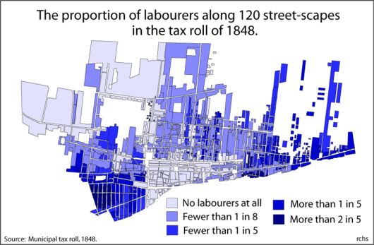 This visual
representation of the built environment does not cover the whole city. The
streetscapes represent only where people are known to have lived, in 1842 110,
by 1848 120. In our application three major indices are shown using this
technique: the number of servants per household in 1842, the number of
households headed by labourers in 1848, seen here, and the median rents in
1848. In our beta release of this application we also had a streetscape of the
franchise in 1842, but subsequent analysis showed that the census returns on
this question were quite misleading. In our gallery of images for the 1840s,
there is a graphic illustration and explanation of the problem.
This visual
representation of the built environment does not cover the whole city. The
streetscapes represent only where people are known to have lived, in 1842 110,
by 1848 120. In our application three major indices are shown using this
technique: the number of servants per household in 1842, the number of
households headed by labourers in 1848, seen here, and the median rents in
1848. In our beta release of this application we also had a streetscape of the
franchise in 1842, but subsequent analysis showed that the census returns on
this question were quite misleading. In our gallery of images for the 1840s,
there is a graphic illustration and explanation of the problem.
How we built our test area for
1880 (en français).
Creating the cadastral layer (in
English).
Rosa Orlandini's report on
the cadastral layer (in English).
Extracts of Caroline Sauriol's report on the 1881 Census (en français).